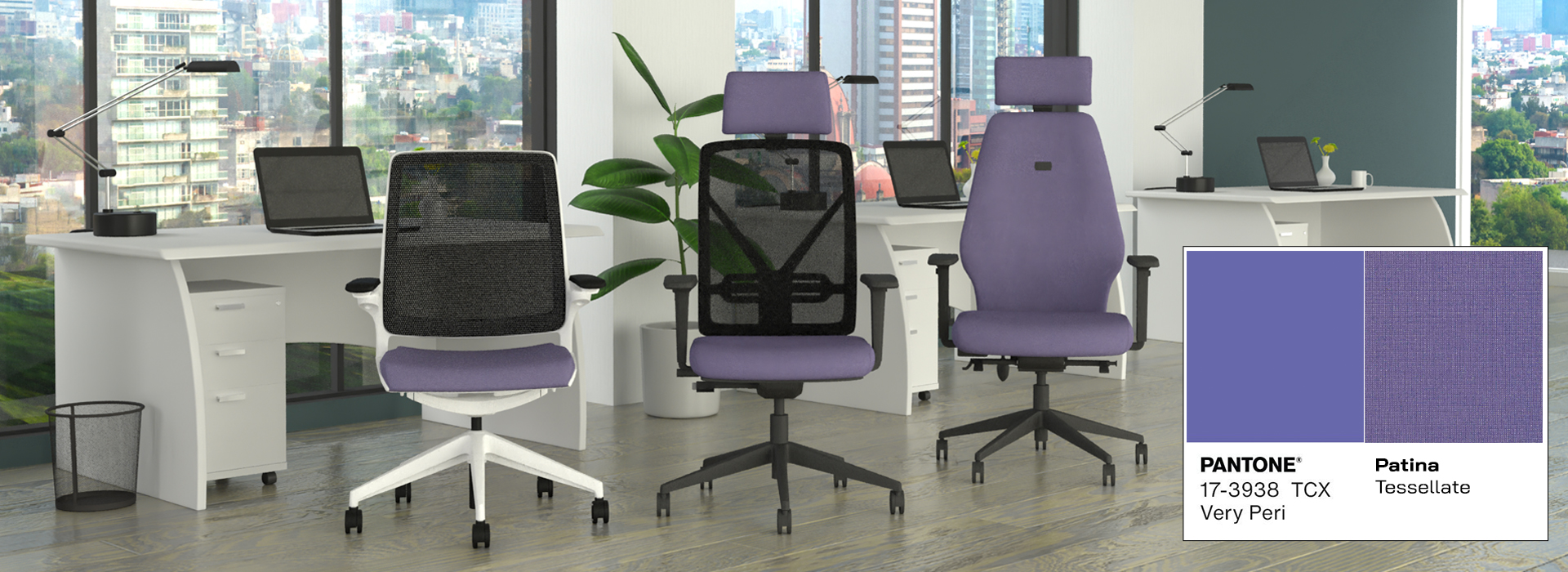
Pantone, the colour institute that declares a specific colour as ‘colour of the year’ describes Very Peri as a ‘dynamic periwinkle blue hue with a vivifying red undertone blends the faithfulness and constancy of blue with the energy and excitement of red.’
How was it selected by Pantone?"The Pantone Colour of the year reflects what is taking place in our global culture, expressing what people are looking for that colour can hope to answer", said Laurie Pressman, vice president of the Pantone Colour Institute.
The Pantone experts explore a various range of factors that affect colour such as colour trends found in fashion, brand marketing, new technologies as well as politics.
Why choose Veri Peri?Innovative in feeling, Very Peri gives a vibrant and confident ambiance, challenging us to seize new opportunities and embrace the future.
In the Home and Office…New lifestyles have been created throughout the pandemic. From working at home, to post – covid office refurbishments, we are gradually starting to return to a normal working environment. Very Peri is a brand-new shade, bringing a versatile, fresh and lively colour to your home or office space.
Very Peri reflects "the global zeitgeist of the moment and the transition we are going through", says Pantone – bringing a warm and refreshing interior feel with Very Peri being a brand-new colour created by Pantone for the first time ever in the history of its Colour of the Year forecasts.
If you’re looking to incorporate Very Peri into your office design, please contact us for information or fabric swatches that complement the 2022 colour of the year.
Contact Us